A Rubbish Thank You & Goodbye

In retrospect, I would first like to thank the entire team of Rubbish Theatre for the past few months. Working with this extremely talented bunch of artists has been a fantastic way to end my University career and ‘If An Orchid Was All You Had’ has been a massive learning curve for me in experimental theatre. The job of the Marketing Manager has also been a learning curve for me and has taught me a lot about how to run a theatre company when I leave University. Because of our ‘thrust’ layout we had a possible 120 seats to sell, however due to popular demand another 40 seats had to be added in order to accommodate all that wanted to see our debut show. As the Marketing Manager, the upmost important job for me was to get a large audience in to enjoy the show that we had worked so hard on for the past few months, and given the fact we over-sold on tickets, I consider my job for the company a success.

To my fellow Rubbishers, it has been a pleasure.

To our tutors, thank you for your invaluable support.

To our audience, goodbye… for now.

WE ARE RUBBISH

WE ARE RUBBISH

Rubbish Video Producer

As well as my role in marketing I was also in charge of designing, filming and editing together short videos for the beginnings of our scenes. After talks with our director, I had a pretty good idea of what to include in each video that would capture our theme of madness. The first video was titled ‘The Birth of Madness’ which featured baby lambs and flowers blooming to represent new life, however the video was then shifted to show insects and virus’ being born still representing new life but in a less conventional way. The way I shifted between the two different was by using an after effect called ‘Bad TV’ that I installed onto my ‘Final Cut Pro’ video editing software which represented our two worlds of madness and sanity. The next video I made was titled ‘The Therapist’ and was to represent our protagonist’s time spent with his therapist, a notebook, pen and mug appeared on the desk after the same ‘Bad TV’ interference to show how even in the man’s real world his madness effects his everyday life. Finally, the last piece of video footage I made was ‘Sadism’ which was to show how we have normalised violence and how we even take pleasure in watching violence and pain being inflicted on others. When designing these videos I made a conscious decision to include clips of both Adolf Hitler and Winston Churchill to show how both sides of World War II were responsible for inflicting pain on others and causing violence. I also included footage of North Korean troops as well as street fighting and boxing to show how we have normalised violence, again each of these pieces of footage were transitioned using the ‘Bad TV’ effect so the consistency was solid throughout all videos. Over all of the videos I also added a white noise sound effect of TV interference to add to the TV theme we had running through our piece.


Rubbish Fundraising

As part of my job as Marketing Manager I am also in charge of fundraising for the company. In meetings with the rest of the group we discussed many ideas to raise money for our company that would also be great ways to advertise for our company. The first idea we had was to do a sponsored ‘stay awake’ for 48 hours, this was because sleep deprivation is linked to madness and we wanted to see how sleep deprivation would affect us as performers and incorporate that into our show. Unfortunately, due to health and safety reasons we were not able to do this fundraiser because of our Universities concerns surrounding the dangers of not sleeping. The next idea we had was to do a sponsored bike ride from Lincoln to Nottingham, this 45 mile ride would have been completed by myself and one of our performers (Jacob Toon). We would set up another Go Fund me page as well as the one we already had to initially receive funding and collect donations in advance for this ride, to keep our audience updated with the ride we would live-stream this on Facebook and Twitter. This ride was all planned and a couple of days before I was going to start advertising and collecting donations, my bike was stolen and the police were unable to trace it so with great regret we had to cancel this fundraiser. With time running out we called an emergency meeting the day after my bike was stolen and decided to hold a sponsored 24 hour ride on our up-cycled bike that featured in our show and an exercise bike. For the location we chose to use a platform outside our University library, theatre and students union as we felt this would be the place with the highest exposure. Choosing the day on which to do it was also important, we decided to start at 12 noon on Wednesday and finishing 12 noon on Thursday, this meant that we would catch a lot of University students working in the library as well as cycling through the SU night, ‘Quack’. As well as cycling for a continuous 24 hours as a company, we were selling up-cycled flowerpots from old tin cans, we filled these with soil and planted a seed and sold them for £2. These flower pots also featured in our installation at the beginning of our performance, it was our plan to make the audience feel as part of our world as possible and these flowerpots aided that. I originally thought that this fundraiser would generate around £50 for the company; however much to our surprise and delight we actually raised £214! This amount of money meant that after talking to our producer, no other fundraisers were needed thus freeing up more time for the company so we could focus on rehearsals. Throughout the sponsored cycle, we had lots of interest from members of the public asking about our theatre company and show, which I believe, helped us in selling as many tickets as we did for our show.

18789549_1339827416073202_1854027542_o

24hr Bike Ride

Some Rubbish Marketing

The website (www.rubbishtheatre.com) was one of the first things I created for Rubbish Theatre. Having a go-to place for audience members and other artists to visit was important for me as visitors can find our manifesto, pictures, information, our team and contact information all in one place. For this, I used a website called ‘Wix.com’ to design our website, I designed the entire website from scratch and used a simple layout so it would be easy to use. As soon as our website was up and running and our Logo was completed I created the Facebook, Twitter and Instagram pages for Rubbish Theatre. Securing a good handle for each social media site was important to me so as soon as we decided on the name ‘Rubbish Theatre’ I secured the handle ‘@Rubbishtheatre’ so anyone searching for us could easily find our pages. One of the most successful posts was the trailer I made for our show, on Facebook this received a whopping 1.4 thousand views. After analysing the ‘insights’ section on Facebook, which tells the owner of a page all the statistics of each post, I discovered that videos were the most successful in terms of likes, shares and views. The likes and followers for each page are as follows,

Facebook: 237 likes

Twitter: 81 followers

Instagram: 132 followers

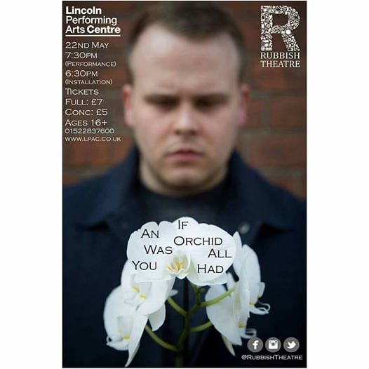
Given the fact that Facebook had our largest following I made sure that any big announcements were posted onto Facebook first, also our live feed posts during our 24 hour cycle were mainly on Facebook whilst only posting one on twitter. Regular tweets have been posted onto twitter throughout our rehearsal process keeping our audience up to date with any news, what we had been up to in rehearsals and sharing our instagram posts. Another marketing tool I used was posters and flyers, working with a local photographer we captured an image of our actors face looking intensely at an orchid with the orchid in focus and the face just out. Using a face in marketing tools is important because we as humans instinctively register faces first before anything else, in fact “The ability to recognize faces is so important in humans that the brain appears to have an area solely devoted to the task: the fusiform gyrus” (Independent). After spending an evening watching ‘Youtube’ tutorials I learnt how to use Photoshop and designed the poster and flyer myself, thus saving money. After giving the Lincoln Performing Arts Centre the required number of posters and flyers I contacted the ‘New Theatre Royal’ in Lincoln and thanks to the generosity of the owners I was able to place the other posters and flyers in their box office and around the theatre. Because of this, I was able to target a very specific audience that is already in a theatre therefore would likely be interested in our show.

18664481_1873161842939175_3138678708802386945_n

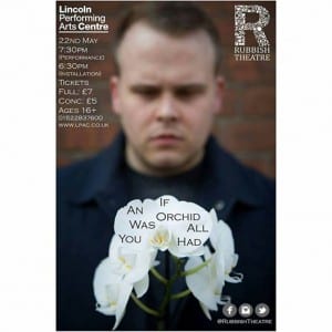
Our Rubbish poster/flyer

A Rubbish Logo

Whilst designing the logo for ‘Rubbish Theatre’, the one thing that was important to me was capturing exactly what we as a company were all about. “When it comes to developing a brand, logo design is king. The power of a logo to elicit an emotional response can have a resounding effect on the way customers and potential customers view a particular product, service or company” (Creative Blog, 2017). Here at Rubbish, we strive to create visually stunning theatre by up-cycling your old ‘rubbish’ and transforming it into the sets for our shows. Because of our up-cycling passion, I wanted to capture this in the logo I had designed and wanted to differentiate between re-cycling and up-cycling. After creating a ‘pintrest’ mood-board with different logos I liked the look of I sketched a rough (very rough, I’m not the most artistically gifted person) design of what I wanted (see figure A), thanks to a talented architect who I knew was good at using Photoshop we were able to create our final logo. Inspired by the ‘Unilever’ logo (see figure B) and the way their ‘U’ was made up of all different products that they sell I wanted a similar design for Rubbish. Combining lots of ordinary house-hold objects we were able to, after a good few hours, create a perfect ‘R’ shape (see figure C) that we hoped would look professional and simple enough to be as recognisable as the ‘Nike’ tick or the ‘Mcdonalds’ golden arches. There are three different types of logo’s one can create when setting up a new brand or company; these are Iconic/Symbolic, Logotype/Wordmark and Combination Marks. Iconic/Symbolic logos “use imagery that conveys a literal or abstract representation of the brand” (Linkedin), Logotype/Wordmark logos “(Incorporate) the brand name into a uniquely styled type font treatment” (Linkedin). Combination Marks “are graphics with both text and a symbol/icon that signifies the brand image. There are integrated and stand alone combination marks (text integrated into the picture or text somewhere near the picture)” (Linkedin) After we had designed and made the logo we experimented with different colors and themes with the logo to see how that would make a difference, using a red rustic theme made our logo look very industrial for example. For the logo we used on our social media pages I chose to use the black and white logo as the simplicity made our company look very professional and more importantly, recognisable.

Figure C

Figure C

Figure B

Figure B


Figure A

Figure A

Works cited –

Creative Bloq (2017) Creative Bloq. [Online] available from http://www.creativebloq.com/graphic-design/pro-guide-logo-design-21221 [accessed 25th May 2017].

Linked In (2015) Linked In. [online] available from https://www.linkedin.com/pulse/theory-behind-designing-good-logos-ligia-stan [accessed 25th May]