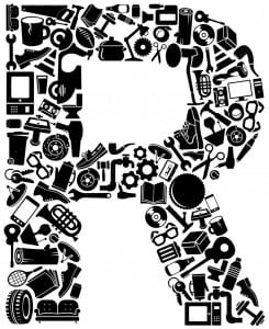
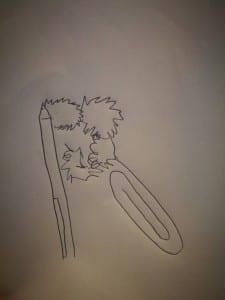
Whilst designing the logo for ‘Rubbish Theatre’, the one thing that was important to me was capturing exactly what we as a company were all about. “When it comes to developing a brand, logo design is king. The power of a logo to elicit an emotional response can have a resounding effect on the way customers and potential customers view a particular product, service or company” (Creative Blog, 2017). Here at Rubbish, we strive to create visually stunning theatre by up-cycling your old ‘rubbish’ and transforming it into the sets for our shows. Because of our up-cycling passion, I wanted to capture this in the logo I had designed and wanted to differentiate between re-cycling and up-cycling. After creating a ‘pintrest’ mood-board with different logos I liked the look of I sketched a rough (very rough, I’m not the most artistically gifted person) design of what I wanted (see figure A), thanks to a talented architect who I knew was good at using Photoshop we were able to create our final logo. Inspired by the ‘Unilever’ logo (see figure B) and the way their ‘U’ was made up of all different products that they sell I wanted a similar design for Rubbish. Combining lots of ordinary house-hold objects we were able to, after a good few hours, create a perfect ‘R’ shape (see figure C) that we hoped would look professional and simple enough to be as recognisable as the ‘Nike’ tick or the ‘Mcdonalds’ golden arches. There are three different types of logo’s one can create when setting up a new brand or company; these are Iconic/Symbolic, Logotype/Wordmark and Combination Marks. Iconic/Symbolic logos “use imagery that conveys a literal or abstract representation of the brand” (Linkedin), Logotype/Wordmark logos “(Incorporate) the brand name into a uniquely styled type font treatment” (Linkedin). Combination Marks “are graphics with both text and a symbol/icon that signifies the brand image. There are integrated and stand alone combination marks (text integrated into the picture or text somewhere near the picture)” (Linkedin) After we had designed and made the logo we experimented with different colors and themes with the logo to see how that would make a difference, using a red rustic theme made our logo look very industrial for example. For the logo we used on our social media pages I chose to use the black and white logo as the simplicity made our company look very professional and more importantly, recognisable.
Works cited –
Creative Bloq (2017) Creative Bloq. [Online] available from http://www.creativebloq.com/graphic-design/pro-guide-logo-design-21221 [accessed 25th May 2017].
Linked In (2015) Linked In. [online] available from https://www.linkedin.com/pulse/theory-behind-designing-good-logos-ligia-stan [accessed 25th May]


